
Loose Ends 125—168
44 unique Loose Ends Spot screenprints

Background
Earlier in the year I made a Loose Ends painting utilising just the spots. A painting focused on simplifying my collage elements and reducing complexity into their purest form of expression. A distillation of one element and exploring deeper. Based on this original painting of 15 colours I wondered, what would a universe of these spots look like? What would a million unique compositions look like? How about 10 million?

Deeper
What would a universe of spots look like?
How do we individually and collectively connect to colour and how does it make you/us feel? Do the spots represent us all together or are they our own personal DNA code; our personality, our defined shades that say ‘this is me’? We are all tiny spots of brilliant colour making up a universe of feeling and connection.
Building a body of work exploring a galaxy of spots and colour with a few rules, metaphorical physics for the planets within the system if you will.
Here is a small sample of around 113,906,25 possible permutations of colour in the series...
After some experimentation of exploring and creating a little ruleset for my universe, I figured out that I could tightrope walk between overwhelming complexity and a sense of individual personality for each composition:
By breaking down each composition to a maximum of 6 layers. (6 layers seems to be the sweet spot to keep each piece feeling individual without merging too much into another). Each composition would consist of 6 colours chosen at random from the palette of 15 from the original painting. I built two Photoshop scripts to produce mock-ups of every possible permutation based on this ruleset:
Script 1
— 6 layers
— Palette of 15 colours
— Each layer a unique colour
= 10,800 (approx) permutations
Script 2
— 6 layers
— Palette of 15 colours
— Each layer can repeat a colour
= 11,390,625 approx permutations
The script would run through every possible combination of colour on each layer. A few problems however…
Although each composition was produced at a tiny file size, I would quickly be close to a total of 84+ terabytes of data if all 11+ million outcomes were produced. Even if you had the storage to hold all of this… if you spent 5 seconds looking at each composition, it would take your 659 days to get through them all!
There is deep complexity here but at the end of the day it is looking for the beauty and human within the machine.

Production Notes
Myself and Jonny at Bicep Press spent a lot of time coming up with a production strategy and allowing room for randomness within a structure. We didn’t want to have any duplicate prints, so how would we achieve this?
With some clever shuffling and juggling of drying prints, colour selection and thinking on the fly. Also embracing just the right amount of randomness.
Our friendship of over ten years has helped form a true collaborative approach to this project as we problem-solved and tight-roped a walk between the analytical and a heart-led instinct. Towards the end of production, our decision-making had to become increasingly faster and on-the-fly and almost telepathic in a dizzying array of colour. The production was a real analogue process. No registration marks, all done on film…. Harder but more true with a few micro-adjustments. I actually changed some colours on the fly to reflect the colour mixing done on the original painting rather than attempting to match them exactly or by reference Pantones etc… it felt more human.
Going on feel with what felt right at the time in the print studio. Some colours weren’t totally washed from the screen on each pass either. That way we carried a carried across a slight tint or warmth, just ever so slightly to give some extra depth. Some colours had a double-hit for some extra punch, and some have a hint of flureo in there for extra POP! Each colour has a unique relationship depending on what colour it goes next to. It can accentuate its neighbour, make it brighter, increase contrast, depth or feeling. Be better together. Some look like ice cream, another feels like 1980’s Intersport branding. The blues, green and brown are something we see all the time in nature. Maybe something buried deep inside us that is hard-wired to enjoy or reverberate with those colours.
As each individual print gained a layer of added colour, the process become quicker and more exciting. Each print coming to life and singing with insanely evocative colour contrast.


Why spots you ask?
Universal:
Spots are a universal shape that everyone can draw and connect with. Making art is to feel human and about self-expression but also to connect to something bigger than ourselves.
Imperfection:
There is no perfect spot, if you look If you look closely, they are all wonky. Perfection is boring. Wonky spots bring personality, soul and ultimately, what makes you, you.
Connect:
The spots are pure expressions of colour. Everyone can connect to colour through association, feeling, sense or memory that provokes investment. Something deeper within us all. Through this, we can break down borders: no lines, only spots.
Turning the idea of an edition on its head.
No two prints are the same and each print exists as a unique 1/1 and is in spirit, a painting.


Loose Ends 163
6 colour hand-pulled screenprint. 410gsm Imperial Somerset Satin stock,
Hand-torn deckled edge, 800 x 800mm 2020.

Loose Ends 155
6 colour hand-pulled screenprint. 410gsm Imperial Somerset Satin stock,
Hand-torn deckled edge, 800 x 800mm 2020.

Loose Ends 167
6 colour hand-pulled screenprint. 410gsm Imperial Somerset Satin stock,
Hand-torn deckled edge, 800 x 800mm 2020.
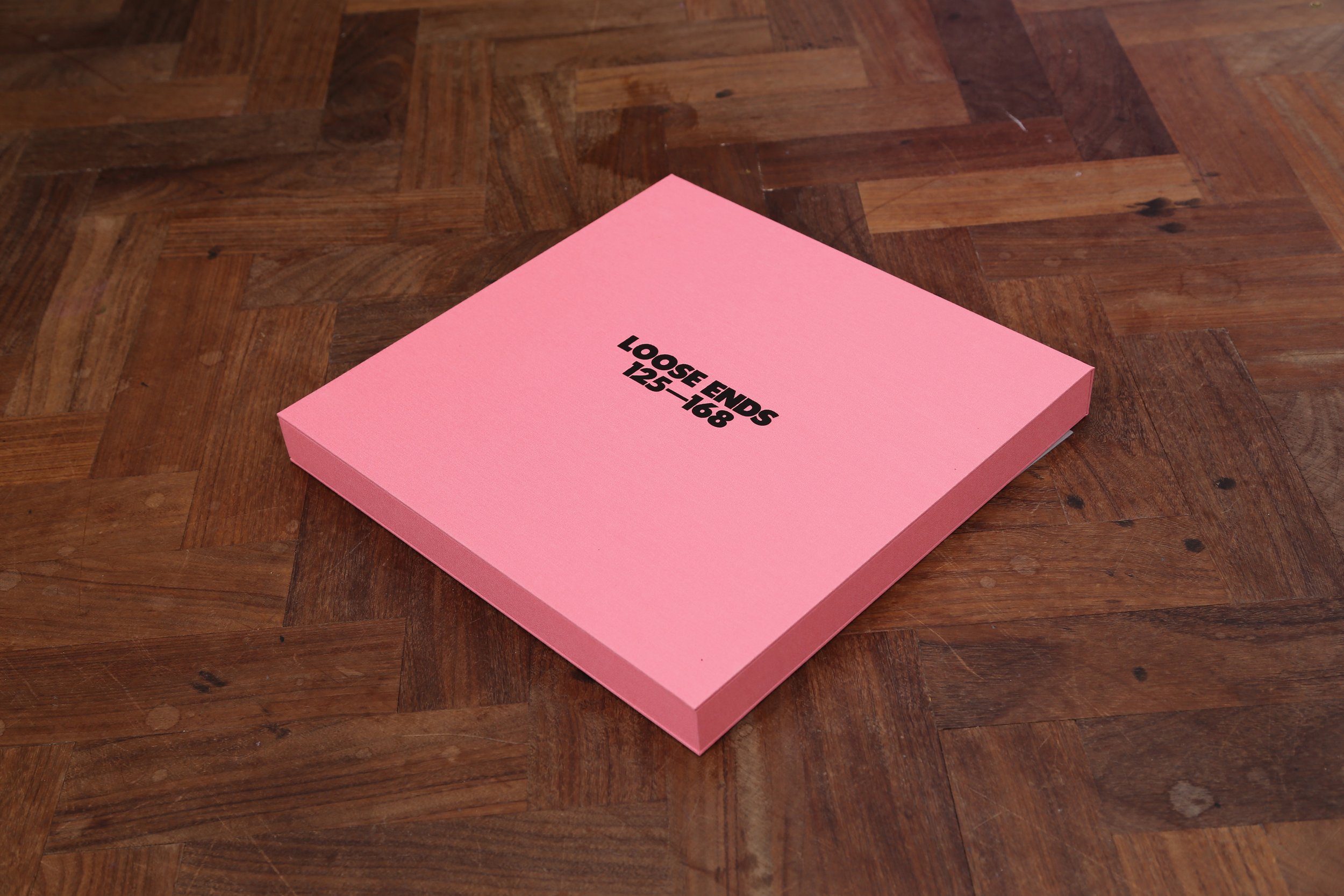
Portfolio Edition
Alongside of the prints, I have produced a a one-off presentation portfolio box of 44 archival giclée art prints.
This limited edition artists’ book serves as a complete reference archive for the Loose Ends ‘spot’ series 125—168 recreated in a smaller scale. The 125—168 collection was originally printed as a hand-pulled, large-format screenprint edition, with each print exists as a unique one-of-one print.
Portfolio Box:
Clam shell, cloth-bound presentation book with finger hole
Letterpressed box cover + internal authenticity certificate signed + dated.
Prints:
x44 unique archival giclée art prints
300gsm fine art photo rag
Hand signed and numbered verso 315 x 315mm (almost LP sleeve size)
Book: Edition of 2 1/2 existing as AP 1 kept back for artists’ archive

Portfolio Edition detail